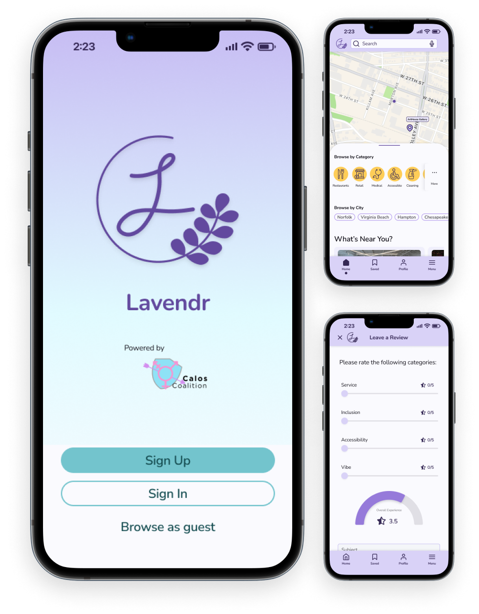
Lavendr: Navigate with Pride
Discover Safe Spaces, Empower your Community
Duration: 2 Weeks
Type: End-to-End Application
Role: UX/UI Design, Research
Tools: Figma, Curve, Optimal Workshop
The Problem
The Hampton Roads area lacks dependable resources for finding and vetting safe spaces for the queer community, especially trans-friendly businesses and services. Existing resources geared towards the LGBTQ+ community are both limited and absent of a vetting process, as they aim for nationwide crowd-sourcing but don't appear to get a lot of use and are seen as unreliable.
Enter: Calos Coalition.
The Calos Coalition is a newly established non-profit organization headquartered in Virginia Beach, VA that seeks to develop a platform to solve this problem on a local level.
I want to design an app that gives users the power to navigate their communities with peace of mind.
Through user surveys and competitive analysis, I identified opportunities to help users discover and rally for businesses and services that align with their ideals, and support an inclusive environment.
Process & Methods
Empathize
“Companies will often use the imagery of safe spaces for marketing purposes, but that doesn’t always reflect who attends the space nor who works there.”
Interviews and surveys helped in connecting with users and members of the community that Calos Coalition serves. Questions that these questionnaires aimed to tackle include:
What are the common challenges you encounter when seeking a safe business or service?
How do you currently identify and evaluate the safety and inclusivity of a business or service? What factors influence your perception?
How does your past experience and cultural identity shape your expectations and requirements for safe spaces when using a resource like a lavender book?
What key features and information do you expect to ind in a resource intended to help you locate safe spaces?
What factors influence your trust of and willingness to use a resource like a lavender book?
A competitive analysis of three similar websites revealed a lack of information for our target audiences’ locality, no mobile app availability, prioritization of businesses over users, and more.
View full analysis here.
“It’s difficult to find places where I can be myself, and I worry about the safety of the broader queer community.”
Overall, study results highlight the diverse experiences and perspectives of participants and underscore the need for improved and interactive resources and more inclusive spaces for historically marginalized communities. It is particularly important to build a product that focuses only on the Hampton Roads area, and to include features that allow the target user to feel heard and supported in their experiences.
Define
Refinement
I wrote out and summarized the results of my research and started brainstorming HMW questions to lay the foundation of the project, landing on this one:
How might we tailor the safe space guide to address the specific needs and concerns of different LGBTQ+ subgroups, and create a trustworthy resource?
Personas
Based on research and insights from Calos Coalition, I created three personas to inform my designs.
Meet Aubrey, Alix, and Shannon; local creative, barista, and teacher, respectively.
Insights reflected in Aubrey, Alix, and Shannon:
Users seek places where they can be their authentic selves without fear of judgment or retaliation.
Users want to discover new places that align with their needs and lifestyle.
Users struggle to know with certainty which places are friendly and inclusive.
Brainstorming Ideas
After narrowing down HMWs and defining my audience, I set out to create a product that would center user needs, and ensure that Calos Coalition’s goals are being reached.
Once we had goals defined and a healthy feature set, I prioritized for the MVP and refined using an impact vs effort matrix.
Ideation session with Calos Coalition Founders Thea & Ty
Information Architecture
Card sorting was done online with Optimal Workshop. This was instrumental in understanding where users expect content to be, and helped create the layout of the site.
With a small number of participants, I used both OW’s best merge dendrogram and their 3D cluster view to guide the IA.
Task Flows
With an initial sitemap in hand, I developed three basic task flows to design and test: Onboarding, Bookmarking, and Leaving a Review.
Ideation
Wireframes
Using Curve, I iterated on sketches for key screens and translated them into wireframes in Figma.
This process allowed for a dynamic visualization of user flows, aiding in the refinement of interface interactions.
Sign Up
Business Page
Home Screen
Account Profile
Test
User Insights
Three participants agreed to test Lavendr’s mobile design, my client, a Calos board member, and a Calos Coalition member. Testers were asked to complete the three tasks of creating an account, bookmarking a page, and leaving a review.
Testers shared an overall positive response to the app, finding it user friendly and clean. They especially appreciated the review process and layout, and provided feedback on what else they would like to see in that flow.
Users wanted to be able to add photos to their review submissions.
Users wanted to be able to filter reviews and search results.
All users instinctively went to browse the medical category to find mental health services.
One user preferred the layout of the reviews section in Lavendr than that of other apps they use.
Select Images
Images in Review Form
Visual Storytelling Amplifies Experiences
Iterations based on usability learnings:
Added a flow for submitting images with a review.
This allows users to complement textual content, aiding in better communication and understanding of customer experiences.
Before
After
Efficiency Through Precision
Iterations based on usability learnings:
Added filter options on search results, reviews, and bookmarks.
Included filters to aid users in refining and narrowing down search results and reviews, improving user efficiency.
After
Before
Enhanced Discoverability
Iterations based on usability learnings:
Added scrollability to categories, allowing more categories to be accessible on the homepage.
Introducing scrollable categories improved content discovery, and better aligns with user instincts.
Design
Visual Identity
I want Lavendr to be an inviting tool that gives peace of mind to users, and links them to the Calos Coalition. Inspired by the Greek meaning of kalos, and the organization’s own website, I put together a mood board and started sketching. I worked out a simple logo, used a palette of cool colors with a splash of sunshine, rounded corners, and found a friendly font in Nunito.
View full style guide and design kit here.
Prototype
Simple Sign Up
An easy and familiar two-step process for creating an account, and the option to add profile details while onboarding so users can begin exploring the app right away.
Effortless Interactions & Discovery
Use the map, browse categories, or search directly for what you need.
Bookmark pages to revisit with a simple tap, and easily access them later from your account or toolbar.
Voices Heard
Be heard by your community in a way that matters to you.
Rate your experience in four categories, and support inclusive businesses and services (or warn others against them).
Reflection
Next steps for building out Lavendr would be to align on what account settings are needed for users, create the “submit a space” form, define and develop an education hub, and cook up some achievement badges!
Lavendr is my second client project, and I learned so much about balancing the needs and vision of an organization aiming to help a vulnerable community.
Thea has founded a wonderful organization in Calos, with multiple ambitious projects set to directly aid our immediate community in the Hampton Roads area. I’m thankful to have the opportunity to help seed the design for their Trans Safe Space List, and look forward to seeing how it evolves!
RangerBot
Mora Flora
TourPro


